Continuing with my election analysis in Georgia, my data source is the Secretary of State’s website:
- 2004 County level results
- 2004 county registration and turnout statistics by race and gender
- 2008 county level results
- 2008 county voter registration statistics by race and gender
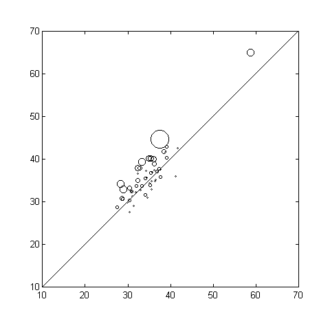
Let’s start with a graph showing Obama’s share of the vote in each Georgia county versus Kerry’s share four years ago. Please note that the size of the circles is proportional to the total number of registered voters in that county.
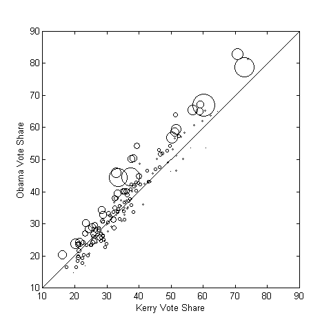
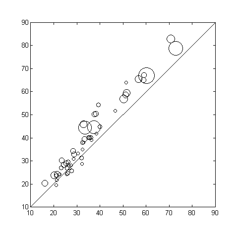
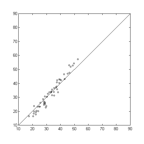
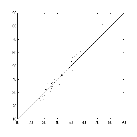
Since there was an 11.4% swing towards Obama compared to Kerry, a majority of the counties show a larger percentage for Obama as compared to Kerry. This is especially true of large (in population) counties. Since Georgia has 159 counties, let’s redo the same graph separately for the large, middle and small counties.
In the largest 53 counties (min number of registered voters 17,354 and max 554,682), only the most Republican counties got more Republican compared to 2004.
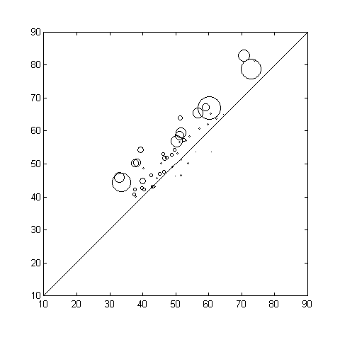
In the middle 53 counties (registered voters ranging from 8,182 to 17,018), the situation was a lot more mixed, but Obama did lose a lot of ground in some.
In the 53 counties with the lowest populations (registered voters ranging from 1,371 to 7,988), Obama did better in some and worse in others. However, these rural counties don’t have many people and probably didn’t matter much at all for the Presidential election.
Since one major reason for Obama’s better performance was the higher turnout and vote from African Americans, let’s look at the same data, i.e. Obama’s total vote share compared to Kerry’s, but by categorizing counties by how white they are. I am using the percentage of registered white voters in a county as a proxy for the percent population that’s non-Hispanic White in a county.
The whitest third of the counties are at least 77% white. Do note that the scales of this graph are different from the earlier graphs. Obama did worse in the smaller, whiter counties than Kerry and better in the bigger white counties. But he didn’t get more than about 35% of the vote in any of them.

The middle third counties by white percentage of the population have about 64% to 77% whites. Obama generally did better than Kerry here. Obama’s share of the vote varied from 27-45% in these counties except for Clarke county (65%) which contains Athens and the University of Georgia.
In the bottom third counties, the white percentage is 18-64% and Obama did very well here.
Let’s look at Obama’s share of the vote in each county plotted against the percentage of whites and blacks in that county.
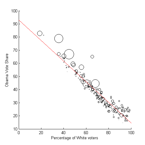
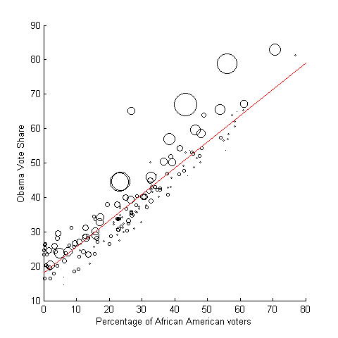
The red line in both graphs is the least squares fit. As is obvious, Obama’s share of the vote decreases as the percentage of whites increases in a county.
In the previous two graphs, we looked at Obama’s share of the total vote. So we cannot completely tease out the effects of a large African American turnout or the how the white voters voted in each county. Since we can’t have the numbers for Obama’s share of the white vote in each county, we’ll make some simplifying assumptions to guesstimate it:
- The African American turnout in each county was the same as the total voter turnout in that county. This is approximately true at the state level, but could be wrong for some counties.
- 98% of the African American voters voted for Obama. This is the percentage at the state level.
- The number of voters who are not African American or White is small enough (5%) that we can approximate the white vote share by simply excluding the African American vote.
We know this procedure gives us only a guesstimate of the nonblack vote since in one small county (Clay) this results in Obama getting -1.85% of the nonblack vote. In the other 158 counties, Obama’s share of the nonblack vote varies from 4.4% (Randolph county) to 54.6% (Dekalb county).
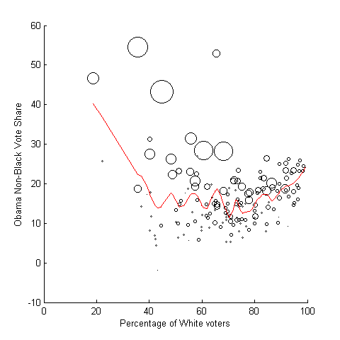
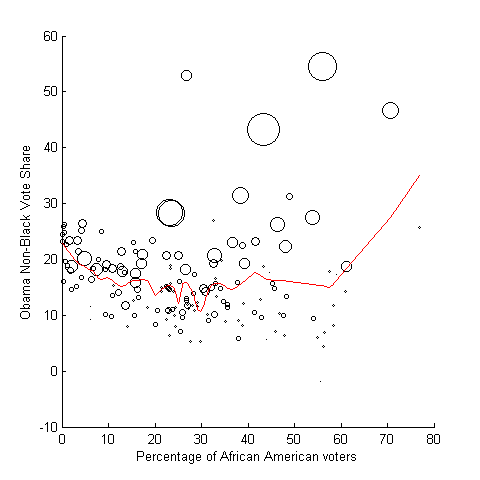
The red lines in both graphs are LOESS fits.
The first thing apparent in these two graphs is that Obama did particularly well among whites in most of the populous counties as they show up outliers at the top. Among the other counties, there is not a significant pattern, but it does look like Obama’s nonblack vote share is lowest in counties where African American population is in the 20-30% range.
Razib did a similar analysis of racial polarization in Mississippi.
Charles Franklin analyzed the white vote for Obama at the state level. Nate Silver saw that data and noticed that most of the states where Obama performed worse than Kerry among whites were those where Obama did not campaign.
Andrew Gellman, at his must-read blog Red State Blue State Rich State Poor State, looked at Obama’s vote share divided by race in the West, Northeast, South and Midwest. He also showed the estimated nonblack vote by county for all of the US.
Andrew Gellman also looked at the voting preferences of rich and poor voters in both red and blue states in the 2008 election, something which is the topic of his book Red State, Blue State, Rich State, Poor State: Why Americans Vote the Way They Do.
Finally, Michael McDonald estimates the voter turnout from the vote eligible population.
My revised national turnout rate for those eligible to vote is 61.6% or 131.3 million ballots cast for president. This number does not include an approximate 1.4 million under and over votes, for an estimated total 132.7 million total ballots cast. This represents an increase of 1.5 percentage points over the 60.1% turnout rate of 2004, but falls short of the 1968 turnout rate of 62.5%.
His estimate of turnout for Georgia is 61.1%, up from 56.2% in 2004.
Next: An analysis of the precincts in Alpharetta, Milton and Atlanta where our team worked.
Very interesting. But what is LOESS fit? Why didn’t you use a least square fit with the weighted data?
Mike: LOESS is a locally weighted least squares quadratic polynomial fit.
Georgia Election Analysis III
Today I dig deeper into the Presidential election results in Fulton county and specifically the precincts in Alpharetta, Milton and South Atlanta where our team of Obama volunteered worked.
Georgia Senate Runoff Analysis
Why did Jim Martin lose so badly in the runoff when he had done so well in the general election?